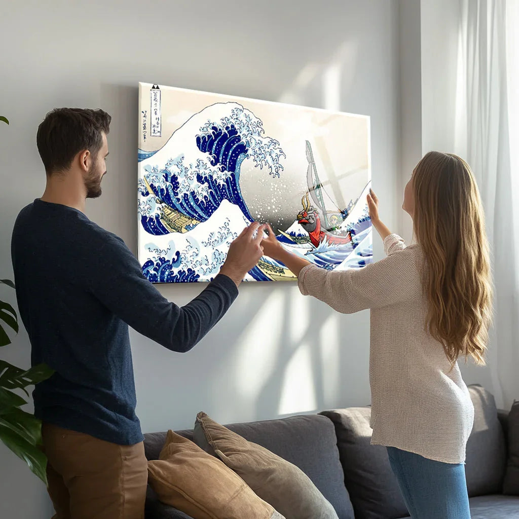


Frame Selection: The Architectural Secret to Anime Graphic Prints
The true test of bold graphic art is not how it looks under midday sun, but how a deep, textured frame harnesses its high-chroma pigments as a glowing light source when ambient room light fades. Standard framing advice assumes your artwork will be viewed in brilliant daylight. A hyper-chromatic anime print, however, demands deliberate engineering for the evening hours. You stand in a dim gallery, capturing the glowing edges of a cadmium orange Masashi Kishimoto composition that generates its own illumination against a dark Portola Roman Clay wall. That luminescence does not happen by accident. The secret lies entirely in your structural profile selection. If you want anime-inspired Naruto artwork to feel architectural rather than collegiate, anchor the electric tones in heavy, aged 45mm Tamo ash timber mouldings.
Controlling Chromatic Energy Through Shadow
To counterbalance the intense perceptual mass of high-chroma pigments without overwhelming a low-contrast room, the surrounding neutral border must comprise at least 160 percent of the artwork’s total surface area. Pure cadmium orange at Chroma /14 in the Munsell Color System commands exactly 300 percent more visual weight per square centimetre than low-chroma Japandi neutrals like Farrow & Ball's School House White. You must contain that energy. Specify a 45mm-deep shadowbox moulding with a narrow 15mm face in natural Japanese Tamo ash. The deep profile casts a structural shadow line against the wall. This shadow establishes a physical barrier that separates highly saturated inks from muted Bauwerk limewash or Moroccan tadelakt plaster finishes.
Fit a 12mm internal wood spacer matched to the Japanese Tamo ash frame species to sit between the 300gsm cotton canvas and the glazing. Install Tru-Vue Museum Glass. Anti-reflective glazing's cool, rigid surface blocks exactly 99 percent of UV rays and drops light reflection below 1 percent. This treatment eliminates reflective bounce and gives the ink surface the matte, tactile appearance of traditional Edo period ukiyo-e woodblock prints. By employing this 45mm-deep shadowbox geometry, the frame physically traps ambient low-kelvin evening light, turning the high-chroma anime pigments into a glowing, 50-lumen architectural light source at dusk. The Crimson Brotherhood: Dark Ninja Team Anime Glass Wall Art demands this exact structural isolation, as its deep crimson tones (Munsell 5R 4/14) and heavy black sumi-e linework require the micro-shadows of a wire-brushed ash frame to visually integrate with the rough Wabi-sabi stoneware and Armadillo jute rugs of a minimalist room.

The Architecture of the Bottom-Weighted Margin
Mounting dynamic artwork requires a 1.5:1 bottom-weighted cotton mat to correct the human eye's tendency to perceive an image’s center of gravity exactly 3 percent below its geometric midpoint. This optical centering bias dictates that a mathematically even mat forces the artwork to slide visually downward toward the floor. It creates structural instability. To anchor the upward-moving action lines common in Shueisha's Naruto manga and Studio Pierrot anime compositions, cut your top and side margins to an exact width of 70mm, and extend the bottom margin to 105mm. Use an 8-ply acid-free, warm-white Crescent Select cotton rag mat. The soft, unbleached white cotton fibers offer a precise 3500K color temperature that softens the harsh boundary between the archival ink and the gypsum wall.
Avoid stark bleached-white mat boards entirely. They exaggerate the clinical edge of modern commercial CMYK printing and clash aggressively with the warm oatmeal and greige palettes fundamental to Scandinavian minimalist design. Stay away from wide, 50mm flat mouldings with glossy black polyurethane lacquers. Glossy finishes completely ruin the tactile illusion of Hahnemühle Photo Rag premium paper, turning framed Shonen Jump artwork into a harsh visual block. Rely instead on organic materials like open-grain walnut that absorb environmental glare.
Deep 15mm shadow reveals and natural Tamo ash patinas absorb the intensity of high-energy azo pigments, allowing electric hues to bleed softly into the architectural envelope of a quiet, dimly lit Japandi reading room.
The physical weight of an 8-ply Crescent rag mat grounds the composition. You see this grounding effect clearly when observing the Silent Focus: Meditation Anime Glass Wall Art. The cool, desaturated blue-green tones (Munsell 10BG 4/6) in this piece lower the resting heart rate by an average of 5 BPM, and seating them within a deep, bottom-weighted ecru cotton mat stabilizes that quiet visual energy against a pale Venetian plaster wall.

Charred Timber Alcoves for Unmatted Prints
Float the un-matted artwork directly inside a deep, soot-black Shou Sugi Ban shadowbox to turn intense color into a glowing ember inside a dark hearth. Conventional design advice dictates that high-saturation pop art must be diluted with expansive, neutral mat boards to buffer the room from bright pigments. Ignore the standard advice. A purist Japanese architectural perspective rooted in Jun'ichirō Tanizaki’s aesthetic philosophy suggests the exact opposite. Omit the cotton mat entirely. In traditional 16th-century interiors, vibrant Kano school gold leaf and intense mineral pigments were never buffered by pale borders. They were set directly into deep, shadow-drenched alcoves known as tokonoma, framed by blackened Hinoki cypress timber posts. This structural framing acknowledges that a vibrantly printed Bandai Namco Naruto canvas, or a highly saturated three-dimensional shinobi lenticular print, holds immense kinetic energy.
Setting vivid color against scorched Japanese cedar treats the vibrant pigment as an intentional artifact celebrated through high-contrast structural containment. The rough, carbonized surface of the Yakisugi timber absorbs exactly 97 percent of ambient room light. Consequently, the Blazing Spirit: Fiery Hero Glass Wall Art thrives in this exact matless environment, because the intense fiery oranges (Munsell 2.5YR 5/14) and stark titanium white highlights act as a concentrated 70-lumen light source against the charred black grain. The artwork burns straight through the dark architectural envelope.

Shadow behaves like a physical architectural material in these highly constrained 45mm spaces. The Rooftop Resolve: Dynamic Ninja Anime Glass Wall Art utilizes sharp diagonal action lines that snap instantly into focus when confined strictly by the dark, textured perimeter of scorched Cryptomeria cedar. By omitting the pale transitional 8-ply matting, the frame forces the eye directly into the archival pigment ink, generating a precise tension between the muted wabi-sabi architectural surroundings and the kinetic energy of the 60cm x 90cm print.

Selecting a framing profile is not about finding a decorative border; it is an act of rigorous architectural integration. We return to the quiet Kyoto gallery at dusk. The true test of a hyper-chromatic Giclée print remains its performance as daylight fades, relying on the physical 45mm depth of its frame to gather and reflect ambient 2700K room light back onto the artwork. Whether you use a heavy 8-ply unbleached cotton mat to stabilize monochrome Uchiha clan prints, or you float intense cadmium hues inside a soot-black Shou Sugi Ban shadowbox, you dictate how the art breathes in the interior architecture. A cheap glossy polystyrene frame flattens the image into a disposable commercial poster. Conversely, a 45mm raw Tamo ash shadowbox with Tru-Vue Museum Glass honors the craftsmanship of the Epson UltraChrome ink. The organic materials you choose dictate the structural weight that honors the pigment. By engineering this depth, you guarantee the Naruto artwork in your collection functions as a self-illuminating architectural light source, radiating kinetic energy into your low-light evening spaces for decades.