

5 Mistakes to Avoid When Buying Wall Art Online
Shopping for wall art online has transformed how we decorate our homes. With thousands of designs at your fingertips, competitive pricing, and the convenience of browsing from your couch, it's no wonder that online art purchases have surged in recent years. But this convenience comes with unique challenges that don't exist when you're standing in a physical gallery, able to see the actual size, touch the materials, and view colors in real lighting conditions.
After helping thousands of customers find the perfect pieces for their spaces, we've identified five critical mistakes that lead to disappointment, returns, and wasted time. Whether you're shopping for your first piece of wall art or you're a seasoned decorator, understanding these pitfalls will help you make confident, informed decisions that you'll love for years to come.
Let's dive into the most common mistakes people make when buying wall art online—and more importantly, how to avoid them.
Mistake #1: Misjudging the Size
The Scenario: You find a stunning abstract piece online. It looks substantial on your screen, the colors are perfect, and you can already envision it above your sofa. You click "buy now" with confidence. Two weeks later, the package arrives, you unwrap it, hold it up to the wall, and your heart sinks. It's tiny. What looked impressive on your laptop screen barely makes an impact on your 10-foot wall.
Sound familiar? You're not alone. Size misjudgment is the number one reason for wall art returns in online shopping.
Why This Happens
Your brain is remarkably adaptable, but it's also easily fooled. On a screen, a 12x12-inch piece occupies the same visual space as a 48x32-inch piece—they both fill your display. Without physical reference points, your mind struggles to translate "30 inches wide" into real-world scale. You can't hold the art in your hands, stand back from it, or see it in relation to your furniture. The result? Most people consistently underestimate how much wall art they actually need.
The psychology of online shopping compounds this problem. We tend to think "that looks big enough" when, in reality, proper scale for wall art almost always feels "bigger than expected" when you're looking at dimensions on paper.
The Real-World Impact
According to our customer service data, approximately 60% of first-time online wall art buyers express surprise at the actual size of their purchase—and the vast majority wish they'd gone larger. A piece that looks "substantial" on a screen often disappears on an actual wall, creating an awkward, unfinished look that undermines your entire room design.
How to Avoid This Mistake
1. Visualize Real Dimensions
Before you buy wall art online, grab a measuring tape and mark the exact dimensions on your wall with painter's tape or even newspaper. This simple step transforms abstract numbers into concrete reality. Suddenly, "40 inches wide" becomes something you can see and evaluate in your actual space.
2. Use the 2/3 Rule
Interior designers rely on a fundamental principle: wall art should occupy 60-75% of the available wall space or the width of the furniture beneath it. For an 84-inch sofa, you need art that spans 50-63 inches minimum. For a king-size bed (76 inches wide), you're looking at 38-57 inches of art width. This proportion creates visual balance and prevents the "floating postage stamp" effect.
3. When in Doubt, Go Bigger
Here's a truth from years of customer feedback: we've never had someone return a piece because it was "too large" (assuming they measured correctly). We have, however, processed countless returns for pieces that were "smaller than expected." Err on the side of bold. A properly-scaled piece makes a statement; an undersized piece makes your room look unfinished.
4. Reference Real-World Objects
Compare the art dimensions to familiar objects. A standard door is 80 inches tall. Your dining table is probably 60-72 inches long. Use these mental anchors to gauge whether a 43x27-inch piece will actually fill your space.
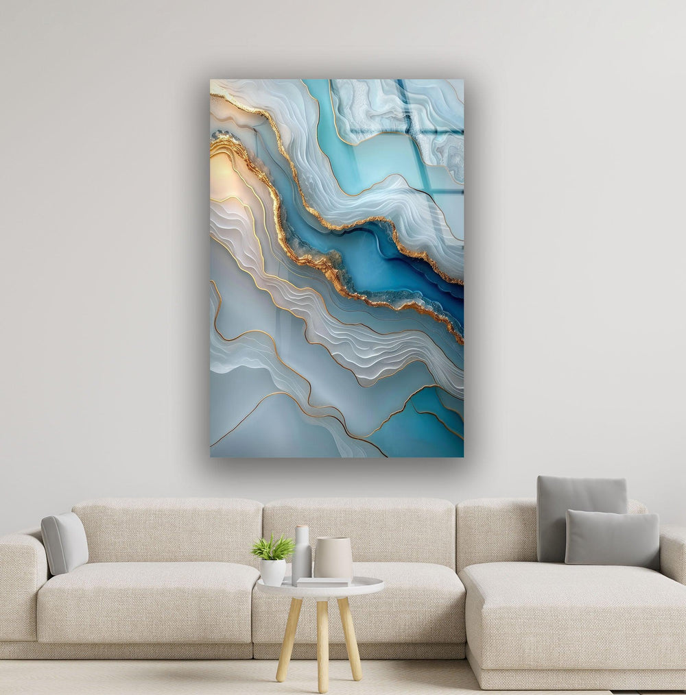
At MyPhotoStation, we offer AR visualization technology that lets you see our wall art on your actual walls before you buy, eliminating size and placement guesswork entirely.
At MyPhotoStation, we've addressed this challenge head-on. Every product page includes detailed dimension information in both inches and centimeters, lifestyle photos showing the art in real rooms, and customer photos that demonstrate actual scale. Our most popular large-format pieces—like the Moon Over The Ocean Glass Wall Art available in sizes from 43x27 inches to 48x32 inches—include room mockups so you can visualize the impact before you buy. We've found that customers who reference these images have a 90% satisfaction rate with their size selection.

Browse our Large Wall Art collection.
Mistake #2: Ignoring Color Accuracy
The Scenario: You spend an hour browsing wall art, finally finding the perfect piece—a vibrant turquoise abstract that will tie together your coastal living room. You complete your purchase, eagerly await delivery, and when it arrives... it's navy blue. Or maybe it's teal. Definitely not the bright turquoise you saw on your screen.
Welcome to the frustrating world of color inconsistency in online shopping.
Why This Happens
Every screen displays colors differently. Your iPhone shows different hues than your laptop, which differs from your iPad, which differs from your partner's Android phone. Screen brightness, color temperature settings, ambient lighting when you're viewing, and even the age of your device all affect how colors appear.
But the problem goes deeper. Screens use RGB (red, green, blue) light to create colors, while printed or manufactured art uses physical pigments. This fundamental difference means that what you see on a backlit screen will never be a perfect match for what arrives at your door. Blues and purples are particularly notorious for shifting between digital and physical representations.
Add to this the fact that your room's lighting—natural daylight versus warm incandescent versus cool LED—will further alter how colors appear, and you have a recipe for disappointment.
The Real-World Impact
Color discrepancy is the second most common reason for returns when customers shop wall art online. The vibrant piece you imagined clashes with your existing decor, or the "bold statement" you wanted arrives looking washed out and dull. This isn't just disappointing—it's expensive and time-consuming to return and reorder.
How to Avoid This Mistake
1. Check Multiple Devices
Before committing to a purchase, view the product on at least two different devices—your phone and your computer, for example. Look at it in different lighting conditions: bright daylight, evening lamplight, and even outdoors. If the colors shift dramatically between views, that's a red flag that you need more information.
2. Read Detailed Color Descriptions
Don't settle for "blue." Look for specific descriptions: "deep navy blue with subtle purple undertones" versus "bright cerulean blue" versus "soft powder blue." Quality online retailers provide detailed color information because they know generic terms don't cut it.
3. Study Customer Photos
Professional product photography is shot in ideal conditions with perfect lighting and color correction. Customer photos, while less polished, show you how the art actually looks in real homes with real lighting. Pay special attention to reviews that mention color accuracy—both positive and negative.
4. Consider Your Room's Lighting
A room flooded with natural light will make colors appear more vibrant and true. A room with warm yellow lighting will shift blues toward green and make reds more orange. Cool white LED lighting will make colors appear crisper but potentially harsher. Think about your room's primary light source when evaluating colors online.
5. Understand Your Color Palette
What's your wall color? What tones dominate your furniture and textiles? Are you looking for art that complements (similar tones) or contrasts (opposite tones) with your existing palette? A piece that looks stunning in isolation might clash terribly with your burgundy sofa or sage green walls.
Our glass wall art collection addresses color accuracy through advanced UV printing technology that delivers exceptional color depth and vibrancy. Unlike traditional printing methods that can appear flat or washed out, our glass printing process creates luminous, true-to-life colors that maintain their intensity for years. We've also found that glass as a medium interacts beautifully with natural light, creating subtle color shifts throughout the day that add depth rather than distortion.
Mistake #3: Overlooking Quality Differences
The Scenario: You're comparing two pieces with the same image—one priced at $79, the other at $189. They look identical in the thumbnail. "Why pay more for the same thing?" you think, clicking "add to cart" on the cheaper option. When it arrives, you understand. The image is pixelated up close, the colors look flat, and the whole piece feels flimsy. You've learned an expensive lesson: not all wall art is created equal.
Why This Happens
Online product photos are designed to look good, and at thumbnail size, a low-quality print can appear identical to a premium piece. The technical specifications—print resolution, material quality, fade resistance—are often buried in fine print that shoppers skip. We're conditioned to hunt for deals, and when two products look the same, choosing the cheaper one seems smart.
But with wall art, you're not just buying an image. You're buying print quality, material durability, color accuracy, fade resistance, and longevity. These factors are invisible in a product photo but dramatically affect your satisfaction over time.
The Real-World Impact
Low-quality wall art reveals its shortcomings quickly. Within months, you might notice colors fading, especially in rooms with natural light. Cheap materials can warp, sag, or develop a "cheap" sheen that undermines your decor. The "bargain" you congratulated yourself on becomes a disappointment you'll need to replace—ultimately costing more than if you'd invested in quality from the start.
We've seen this pattern repeatedly: customers who prioritize price over quality end up shopping for wall art again within 6-12 months. Those who invest in quality pieces report satisfaction years later.
How to Avoid This Mistake
1. Look for Quality Indicators
When you shop wall art online, search product descriptions for specific quality markers:
- Print Resolution: Minimum 300 DPI (dots per inch) for sharp, clear images
- Material Specifications: Glass thickness, canvas weight, frame construction details
- UV Protection: Prevents color fading from sunlight exposure
- Fade-Resistant Inks: Ensures colors stay vibrant for years
- Warranty Information: Quality sellers stand behind their products
2. Read the "What's Included" Section
Is mounting hardware included, or will you need to buy it separately? Does the piece come with a protective backing? Is installation guidance provided? These details separate quality products from cheap alternatives.
3. Mine Customer Reviews for Quality Insights
Look beyond star ratings. Read what customers say about quality after living with the piece. Search for phrases like:
- "Exceeded expectations" vs. "looks cheap in person"
- "Colors still vibrant after six months" vs. "already fading"
- "Sturdy and well-made" vs. "flimsy" or "lightweight"
- "Worth the price" vs. "overpriced for the quality"
4. Evaluate Price-Quality Relationship
Extremely low prices are red flags. If a 48x32-inch piece costs $29.99, ask yourself: how is that possible? Quality materials, professional printing, proper packaging, and fair labor all cost money. Conversely, high prices don't automatically mean high quality—you might be paying for brand prestige rather than superior craftsmanship.
Mid-range pricing often offers the best value: quality materials and workmanship without luxury brand markup.
5. Consider Lifetime Cost
A $79 piece that needs replacing in two years costs more than a $189 piece that looks beautiful for a decade. Factor longevity into your decision when you buy wall art online.

Quality is non-negotiable in our production process. We use premium UV printing technology on high-grade glass, ensuring sharp detail and color accuracy that lasts. Our glass wall art pieces are printed at professional resolution, creating gallery-quality results that maintain their vibrancy even in high-light environments. Every piece includes professional-grade mounting hardware, and we back our products with detailed care instructions and responsive customer support. Our return rate for quality issues is less than 2%—compared to an industry average of 15-20%—because we invest in materials and processes that deliver consistent, exceptional results.
Browse verified customer reviews for MyPhotoStation.
Mistake #4: Not Understanding Material Benefits for Your Needs
The Scenario: You're browsing wall art and notice the same design available in both glass and canvas. They look identical in the photos. You shrug and pick whichever is cheaper or ships faster, not realizing that your choice will significantly impact your satisfaction, maintenance requirements, and how the piece performs in your specific space.
Why This Happens
When shopping for wall art online, most people focus exclusively on the image—the subject, colors, and style. The material seems like a minor detail, a technical specification that doesn't really matter. After all, if the picture looks the same, what's the difference?
But materials aren't just about aesthetics. They determine how your art interacts with light, how it holds up in different environments, how easy it is to maintain, and how it contributes to your room's overall style. Choosing the wrong material for your needs can turn a beautiful image into a disappointing purchase.
The Real-World Impact
We've seen customers hang canvas art in humid bathrooms only to watch it warp and develop mold. We've seen others choose framed prints for modern minimalist spaces, then feel frustrated by the traditional, heavy look. The right image on the wrong material creates a mismatch between expectation and reality.
How to Avoid This Mistake
The key is understanding what each material offers and matching those benefits to your specific needs, lifestyle, and space.
Glass Wall Art—Ideal When:
✅ You prefer modern, minimalist, or contemporary interiors. Glass offers a sleek, frameless aesthetic that complements clean-lined spaces beautifully.
✅ You're decorating high-moisture areas. Bathrooms, kitchens, and humid climates demand moisture-resistant materials. Glass won't warp, mold, or deteriorate in these conditions.
✅ Easy maintenance is a priority. Glass surfaces wipe clean with a damp cloth—no special care required. Perfect for busy households, homes with children, or allergy-sensitive environments.
✅ You have abundant natural light. Glass interacts beautifully with light, creating subtle depth and luminosity that changes throughout the day. It enhances rather than absorbs light.
✅ You want vibrant, lasting color. Glass printing technology delivers superior color depth and saturation that remains vivid for years without fading.
✅ Long-term durability matters. Glass resists UV damage, moisture, and wear far better than many alternatives, making it a smart long-term investment.

Browse our Glass Wall Art collection.
Canvas Wall Art—Ideal When:
✅ You prefer traditional, classic, or rustic interiors. Canvas brings warmth and texture that suits these styles perfectly.
✅ You love a textured, artistic look. The woven surface of canvas adds tactile dimension that some people find more "art-like."
✅ You want a softer, warmer aesthetic. Canvas has an organic quality that feels less formal than glass.
✅ You prefer gallery-wrapped edges. Canvas can wrap around the frame edges, creating a finished look without needing a traditional frame.

Browse our Canvas Wall Art collection.
Ask Yourself These Questions:
- Does my room have high humidity or moisture? → Glass
- Do I prefer modern or traditional style? → Glass vs. Canvas
- Is easy cleaning important to me? → Glass
- Do I love texture and want a "painterly" feel? → Canvas
- Will this piece get direct sunlight? → Glass (superior fade resistance)
- Do I want light to interact with my art? → Glass
We offer both glass and canvas wall art because we understand that different spaces and personal styles have different needs. Our glass collection excels in modern environments and moisture-prone areas—we've installed glass pieces in hundreds of bathrooms and kitchens with zero moisture-related issues reported. Our advanced glass printing technology creates depth and vibrancy that customers consistently describe as "better than expected." Meanwhile, our canvas options bring warmth to traditional spaces. Each product description clearly states which material suits which environments, taking the guesswork out of your decision. When you shop wall art with us, you're not just choosing an image—you're selecting the optimal material for your specific needs.
Mistake #5: Not Considering Room-Specific Requirements
The Scenario: You fall in love with a bold, energetic abstract piece bursting with reds, oranges, and electric yellows. It's stunning. You buy it immediately, hang it in your bedroom, and then... you can't sleep. The piece is too stimulating, too "loud" for a space meant for rest and relaxation. What works beautifully in a living room becomes overwhelming in a bedroom.
Why This Happens
When shopping for wall art online, you're viewing pieces in isolation—just the art against a white background or a generic room mockup. There's no context. You can't see how it relates to your specific wall color, existing furniture, lighting conditions, or the room's purpose. You're making decisions based on "I like this" rather than "this works in my space."
The impulse to buy what we find beautiful is natural, but wall art isn't just about beauty—it's about appropriateness. The right piece in the wrong room creates discord instead of harmony.
The Real-World Impact
Mismatched art and room function leads to subtle but persistent dissatisfaction. That vibrant piece that energizes your living room might prevent relaxation in your bedroom. The delicate, detailed artwork that's perfect for close viewing in a hallway gets lost in a large, open-plan space. The coastal scene that complements your beach house aesthetic clashes with your urban loft's industrial vibe.
How to Avoid This Mistake
Think beyond "do I like this?" and ask "does this work for this specific room?" Here's how to match wall art to room requirements:
Living Room (High-Traffic Social Space)
Best Choices:
- Bold, conversation-starting pieces that guests will notice and discuss
- Large scale (minimum 48x32 inches for standard walls, larger for expansive spaces)
- High-contrast art that remains visible across the room
- Themes: Abstract, cityscapes, nature scenes, pop culture, architectural photography
Why: Living rooms are active, social spaces where art should make a statement and withstand visual "competition" from furniture, people, and activity.
Material Consideration: Glass for modern spaces, canvas for traditional warmth.

Browse our Living Room Wall Art collection.
Bedroom (Calm, Personal Retreat)
Best Choices:
- Soothing, calming themes: ocean scenes, soft abstracts, serene landscapes, gentle botanicals
- Calming color palettes: blues, greens, soft neutrals, muted tones
- Horizontal orientation above the bed
- Size: 50-75% of headboard width
Why: Bedrooms should promote relaxation and rest. Overly stimulating art can actually interfere with sleep quality.
Material Consideration: Personal preference, but prioritize calming imagery over material.

Browse our Bedroom Wall Art collection.
Bathroom & Kitchen (Moisture and Functionality)
Best Choices:
- Moisture-appropriate materials (critical in bathrooms)
- Easy-to-clean surfaces
- Themes: Coastal, botanical, abstract, spa-like imagery
- Avoid food clichés in kitchens (coffee cups, wine bottles)—go for sophisticated abstracts or nature scenes instead
Why: These rooms have practical challenges (humidity, splashes, steam) that demand durable materials.
Material Consideration: Glass is ideal for moisture resistance and easy cleaning.

Browse our Kitchen Wall Art collection.
Dining Room (Sophisticated Entertaining)
Best Choices:
- Elegant, sophisticated themes that enhance the dining experience
- Horizontal pieces above buffets or consoles
- Round pieces that echo dining table shapes
Why: Dining rooms set the tone for meals and gatherings. Art should feel refined without being distracting.
Material Consideration: Glass for modern elegance, canvas for traditional warmth.

Browse our Dining Room Wall Art collection.
Office (Productivity and Inspiration)
Best Choices:
- Inspiring, motivational themes
- Personal interests: travel photography, hobby-related art, meaningful quotes
- Vertical pieces work well on narrow walls beside desks
- Avoid overly busy or distracting compositions
Why: Office art should energize and inspire without pulling focus from work.
Material Consideration: Glass offers a professional, polished look that photographs well in video calls.

Browse our Office Wall Art collection.
Hallway & Entryway (First Impressions)
Best Choices:
- Statement pieces that create immediate impact
- Vertical orientation for narrow hallway walls
- Gallery walls work beautifully in entries
- Bold enough to be noticed in passing
Why: These transitional spaces offer brief viewing moments—art needs to make quick impact.
Material Consideration: Based on overall home aesthetic; glass works well in modern entries.
Additional Considerations:
Lighting Conditions:
- High natural light: Glass art thrives here, interacting beautifully with changing daylight
- Low light rooms: Choose high-contrast pieces with lighter tones that won't disappear in dim conditions
- Direct sunlight: Prioritize fade-resistant materials and UV protection
Color Coordination:
- Complement your existing palette—don't try to match exactly (matching looks forced)
- Use art to introduce accent colors that tie the room together
- Consider your wall color: light walls need bold art for contrast, dark walls need lighter pieces to stand out
Viewing Distance:
- Large rooms with distant viewing need bigger, bolder pieces
- Intimate spaces allow for detailed, intricate art
- Hallways and narrow spaces benefit from vertical orientation

Browse our Decorative Wall Art collection.
Shop Smarter, Decorate Better
Buying wall art online doesn't have to be a gamble. By avoiding these five critical mistakes—misjudging size, ignoring color accuracy, overlooking quality differences, misunderstanding material benefits, and neglecting room-specific requirements—you transform online shopping from a risky proposition into a confident, satisfying experience.
The key is shifting from impulse-based decisions to informed choices. Take the extra ten minutes to measure your wall, view colors on multiple devices, read quality specifications, understand material advantages, and consider your room's specific needs. These small investments of time prevent expensive mistakes and ensure you'll love your purchase for years to come.