

Beyond Decoration: Horizontal Artwork as a Nostalgia Tool
The physical substrate of your horizontal living room artwork dictates the specific type of nostalgia a space evokes, proving that palette debates go far beyond mere colour temperature. Smooth finishes, such as museum-grade acrylic glazing, pull from your lived past, whereas textured mediums transport you to an idealized history. Cool, desaturated blues engineer the sharp clarity of early morning. Warm ochres mimic the fading light of late afternoon. You stand in a newly finished space and notice a distinct disconnect. A vintage Herman Miller walnut credenza sits period-accurate against the wall. Desaturated blue-green paint, specifically Munsell hue 10BG, matches the linen upholstery precisely. Track lighting, such as the Erco Parscan system, projects exact lumens onto the floor. Yet the environment feels clinical, mirroring a minimalist gallery. Spatial dimensions measure correctly, but the room lacks an anchor in time. This specific hollowness is a failure of nostalgia.
Understanding material psychology prevents costly curation mistakes and allows you to engineer the emotional frequency of your interior architecture. Selecting a 300gsm Hahnemühle cotton rag over standard poster paper alters how light interacts with the pigment, shifting the aesthetic from temporary decoration to an archival artifact on par with a Smithsonian preserved lithograph.
Graphic Precision and the Autobiographical Memory
Psychological assessments on material perception indicate that smooth pigment prints on 300gsm acid-free cotton rag prompt faster cognitive retrieval of autobiographical memories compared to woven canvas. Smooth archival surfaces and glass-fronted lithographs stimulate personal memory retrieval by referencing the sharp clarity of mid-twentieth-century editorial photography, such as iconic Richard Avedon prints. The absence of surface grain mirrors Bauhaus modernism rather than pre-industrial painting. Researchers studying nostalgia draw a foundational distinction here by identifying this specific phenomenon as personal nostalgia. It roots itself in the autobiographical self, triggered by concrete sensory cues that link directly to a culturally familiar timeline. When you view a flat, untextured surface, your brain associates it with photographic evidence of reality, locking you into a known past.
Scale these smooth geometric prints using rigid mathematics to maximize their psychological impact. Interior design consensus consistently champions the strict arithmetic of visual anchoring. Observational analysis indicates that artwork scaled to exactly two-thirds of the anchor furniture width strongly stabilizes spatial equilibrium. Viewers fix their gaze on the visual centre considerably longer when proportions align with architectural logic. This math never lies. For a standard 210cm mid-century console, like a Florence Knoll sideboard, you require a 140cm wide piece in a 2:1 ratio to master the horizontal layout proportions interior architecture demands. Mount these prints in a 1.5cm slim American walnut frame, matching the Nielsen profile 117, with a 5cm acid-free Crescent Select mat. Hang the bottom edge exactly 15cm to 20cm above the flat-topped furniture. Ensure the optical centre rests at 145cm from the finished floor to lock the frame and credenza into a single cohesive visual anchor.
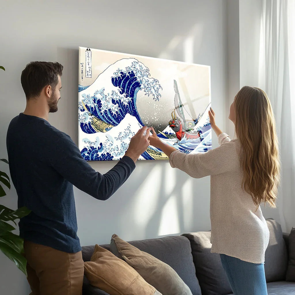
This sharp presentation defines the Wave Kanagawa Glass Wall Art. The smooth glass substrate eliminates distracting textural grain, forcing focus onto the crisp ukiyo-e linework originating from Katsushika Hokusai and desaturated Prussian blue pigments, chemically known as iron hexacyanoferrate. Such a clean finish establishes a streamlined horizontal sightline that commands attention without overwhelming your peripheral vision.

The honest limitation of this high-gloss approach is its inherent coldness. Glass glazing, such as Tru Vue Optium Museum Acrylic, and flat archival paper reject organic depth. They demand highly disciplined, minimalist surroundings to avoid feeling corporate. This rigid presentation translates exceptionally well to the compact, light-starved spaces UK buyers seeking horizontal wall pieces optimize, as well as sprawling modern houses, like classic Eichler homes, requiring expansive horizontal designs for coastal environments.
How Woven Textures Manufacture Pre-Industrial Escapism
A textured surface engineers a connection to an idealized history, whereas smooth glass grounds you in sharp, retro realities. Heavy woven canvas substrates generate an aestheticized yearning for an unlived era by mimicking the organic depth of aged Rembrandt oil paintings. Because the physical substrate of your artwork dictates the specific type of nostalgia a room evokes—shifting the viewer’s psychological response from sharp autobiographical memory to romanticized historical escapism—material selection outweighs graphic design. Viewers observing pastoral scenes on textured canvas consistently attribute a higher sense of historical antiquity compared to those viewing identical images on smooth paper. This phenomenon is historical nostalgia. It operates as a vicarious escape into a romanticized past.
To stimulate this historical warmth, designers stretch heavy 400gsm Fredrix poly-cotton canvas finished with a hand-applied brushstroke gel glaze. They mount the piece in an unglazed, 3.5cm-deep limed-oak or antiqued-pine floater frame, specifically mimicking the Roma Moulding Lavo line. An exposed woven texture and lack of glazing cleverly imitate aged oil masterpieces. Over plush, rounded seating, hang the bottom edge of a 16:9 canvas 20cm to 25cm above a velvet sofa backrest, like a Mario Bellini Camaleonda. This increased gap accounts for cushion compression and throw pillows while preventing the taller frame from crowding the seating zone. The rougher surface softens the rigid boundaries of modern architectural drywall by introducing organic, painterly depth.
Placing a cottagecore pastoral scene behind high-gloss glazing is a structural mistake. Standard glossy glass produces specular reflections that destroy the organic warmth of muted sage greens resembling Farrow & Ball French Gray, dusty roses mimicking Sulking Room Pink, and earthy creams. Reflected glare pulls the viewer out of the nostalgic pastoral illusion and reminds them of cold manufactured surfaces. Such visual disruption makes matte, textured canvases the superior choice for horizontal bedroom layouts where visual softness and acoustic dampening are highly valued priorities.
If you utilize the Elven Waterfall Kingdom Glass Wall Art, Fantasy Castle Scene, you must strictly control the ambient lighting, keeping colour temperatures explicitly below 3000K Kelvin. The high-gloss finish inherently fights the romanticized fantasy subject matter by generating specular reflections that disrupt the historical illusion. You must position the panel away from direct window glare to maintain the intended escapism.

The primary limitation of heavily textured, unglazed canvas is its tendency to degrade sharp vector graphics, such as Swiss Style typography. Printing clean, minimalist horizontal gallery graphics on a coarse gallery-wrapped canvas creates stylistic dissonance. A three-dimensional woven grain blurs deliberate colour blocks and mimics cheap hospitality decor rather than precise modernist curation.
| Design Factor | Smooth Archival Glass (Option A) | Textured Giclée Canvas (Option B) |
|---|---|---|
| Nostalgia Mechanism | Personal (Autobiographical memory retrieval) | Historical (Vicarious pre-industrial escapism) |
| Ocular Saccade Impact | Stabilizes spatial equilibrium when scaled to 2:1 ratio | Softens sharp architectural boundaries through organic depth |
| Optimal Material Density | 300gsm 100 percent Hahnemühle cotton rag with museum-grade glazing | 400gsm Fredrix poly-cotton blend with brushstroke gel glaze |
| Ideal Vertical Offset | 15cm to 20cm above flat-topped mid-century architecture | 20cm to 25cm above plush, compressible cottagecore seating |
Determining the Correct Proportional Rupture
Radical proportional deviation shatters visual complacency. The deciding factor between these two nostalgic modes is your willingness to abandon standard mathematical anchoring in favour of radical scale disruption. While traditional interior design orthodoxy insists on the two-thirds furniture width rule to ensure balanced visual anchoring, intentional scale disruption provokes a more intense emotional response.
In mid-century modern environments, sourcing small horizontal layouts and positioning them radically off-centre forces active observation. Hanging the Girl with Balloon Banksy Glass Wall Art at only 35 percent of a USM Haller credenza width utilizes negative space, rooted in Bauhaus and Scandinavian asymmetric balance. This composition forces the viewer to engage with the lithograph as an isolated historical relic rather than passive decoration. The high-contrast monochrome design benefits from this intentional under-sizing, drawing the eye precisely because it refuses to anchor the furniture conventionally.

Conversely, deploying expansive horizontal installations that span 100 percent of a king-size Thonet headboard width functions as an atmospheric mural. Sourcing wide, desaturated pieces like the Blue Dandelion Flower Glass Wall Art for horizontal above-bed applications completely overrides the furniture presence. Cool, oversized floral forms function as a pastoral window, flooding the visual field with historical calm rather than strict architectural discipline.

Because the physical substrate of your artwork dictates the specific type of nostalgia a room evokes—locking you into a lived personal past with glass or an idealized historical escapism with canvas—your final material choice operates as a foundational architectural decision. Material surface dictates the nostalgic emotion, but physical scale controls the intensity of that feeling in your room. Choosing smooth museum-grade glass sharply recalls a lived past, whereas expansive canvas texture fully immerses you in a manufactured history. Finding the correct substrate to anchor your own interior architecture is simply a matter of selecting from a dedicated horizontal art collection.